Hello, fellows!
First, I’m so sorry for the delay… I’ve been working hard both on Edge of Eternity’s Early Access (coming soon!), and on this project.
Though I didn’t find the time to write this article, I try to keep up the pace! =’ D
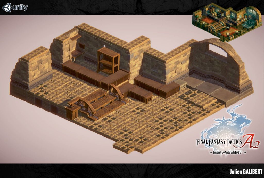
Ok! This week, I worked on creating objects for the 3D render of the Inn in Final Fantasy Tactics Advance 2 3D Fanart: furnitures, and other stuff !
Working on smaller objects allowed to me to definitively find the Art graphic style I wanted to go for. Until now, I didn’t commit to any art style because I wanted to experiment a bit more, take the time to test a few things before getting a definitive feel of the scene.
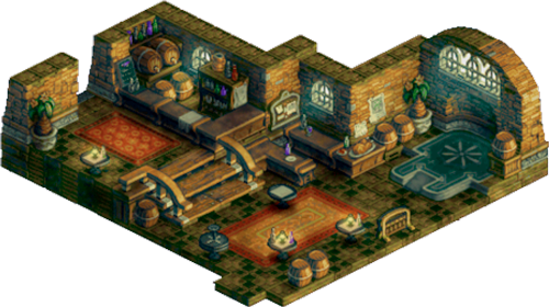
Remember you the gabarit:
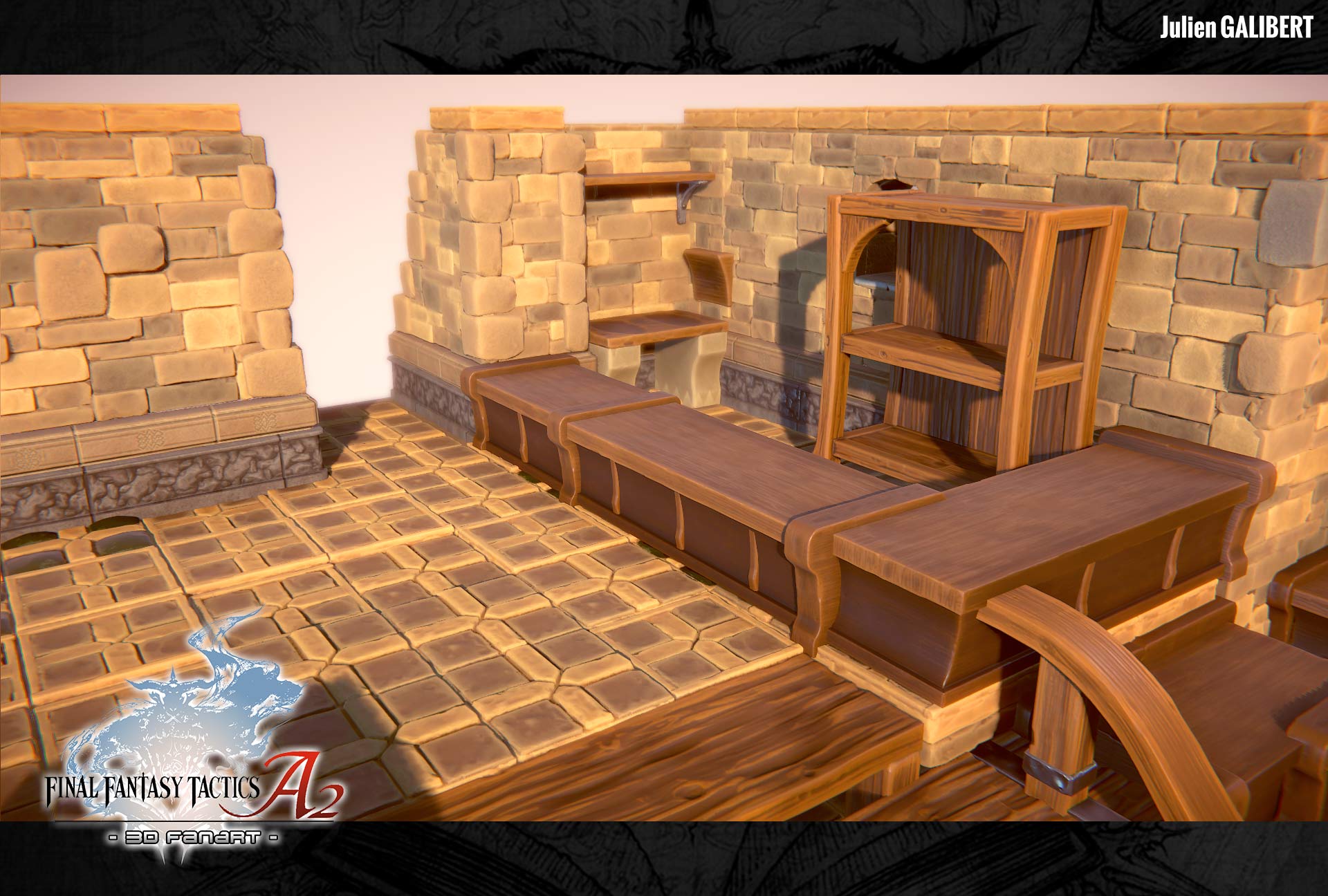
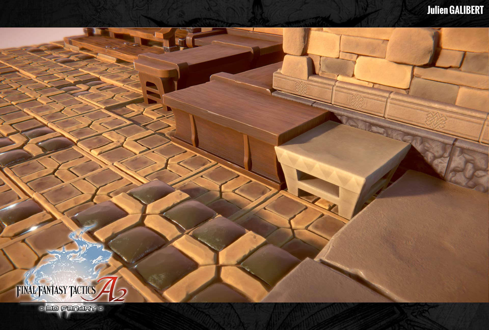
We graphic designers often say that the difference between a professional and amateur is the capacity to remain consistent in a pre-defined style.
It is true, but still it has to be defined beforehand! And now, guess what? Tadaaa – here it is!
It is what this project is actually: an exercise in style… and it is only recently that I had a precise idea of the render that I wanted for it. Now that I found it, it’ll be easier for me to find a harmony between of the scene’s objects.
Just like the stairs, I played with a very limited numbers of tint for the wood to be consistent with my graphic style.
We cannot see much about the table with barrels on the pixel art model, so… I have to improvise!
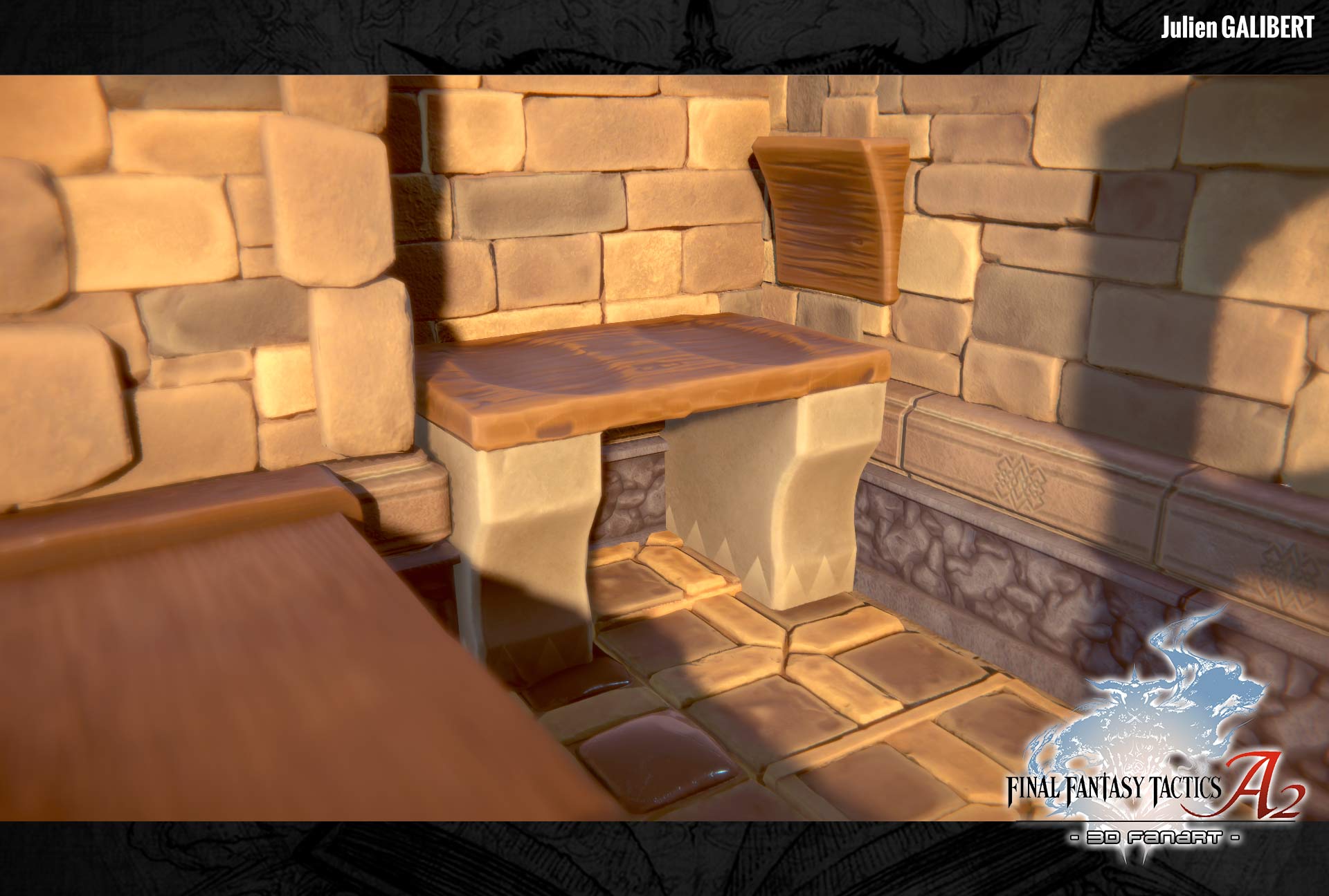
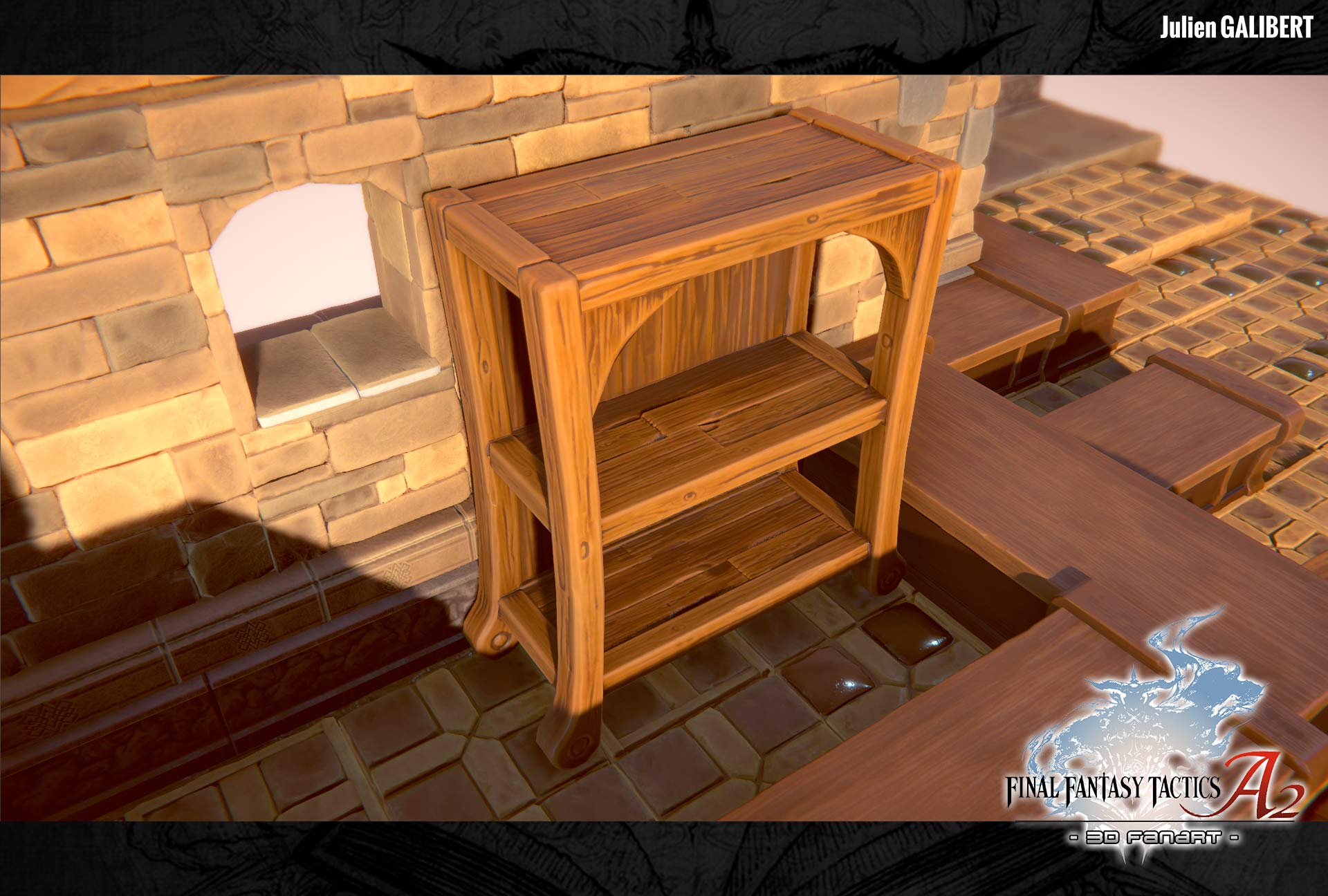
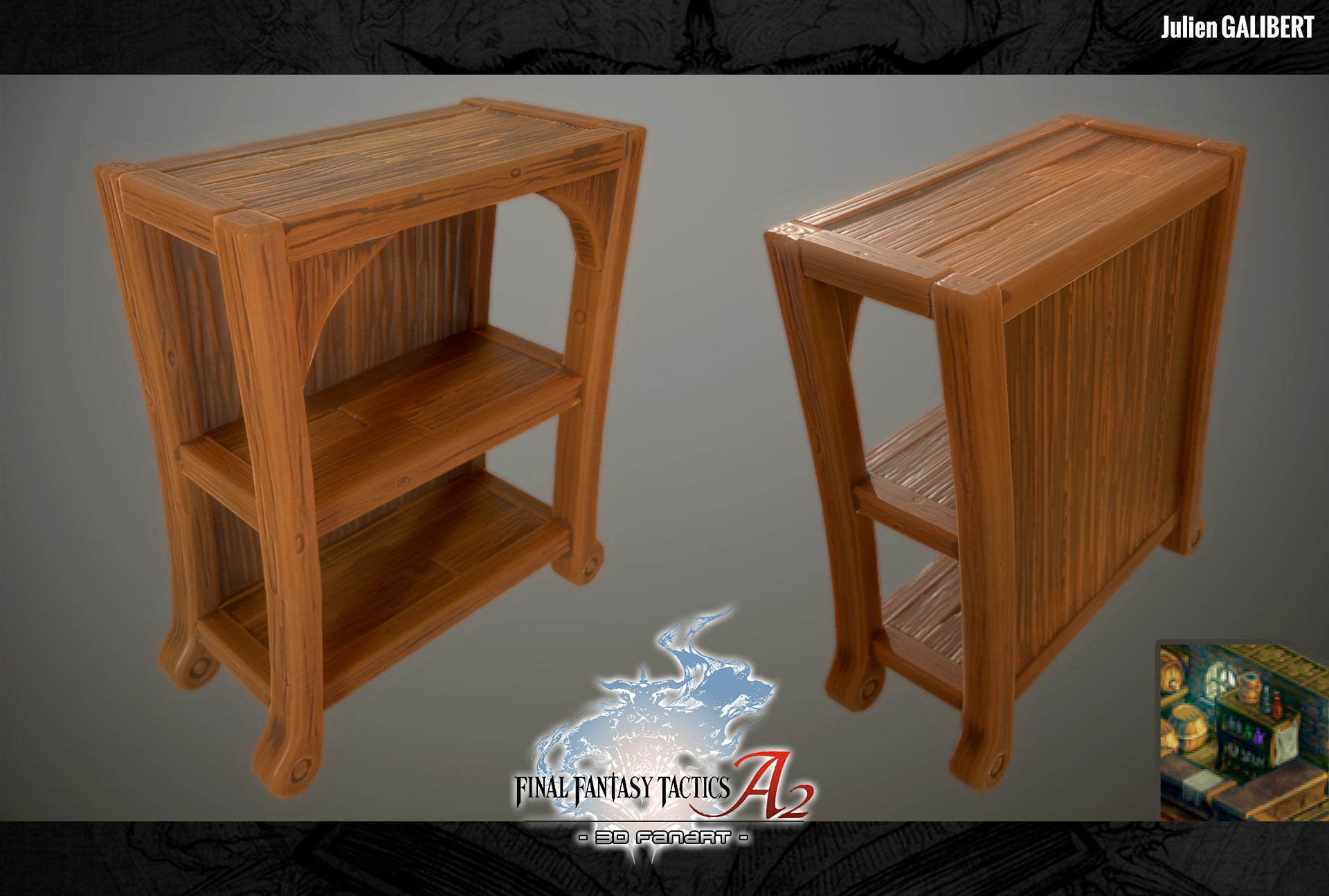
I loved doing shelves, it’s one of the most stylish piece of furniture. = )
And I’m overall happy about the result… It’s starting to add up and fill the room!
Next objects will be very cool so, stay tuned ! =D
To be informed of latest news, you don’t forget to like my Facebook page: https://www.facebook.com/YurieDesign

Stay connected